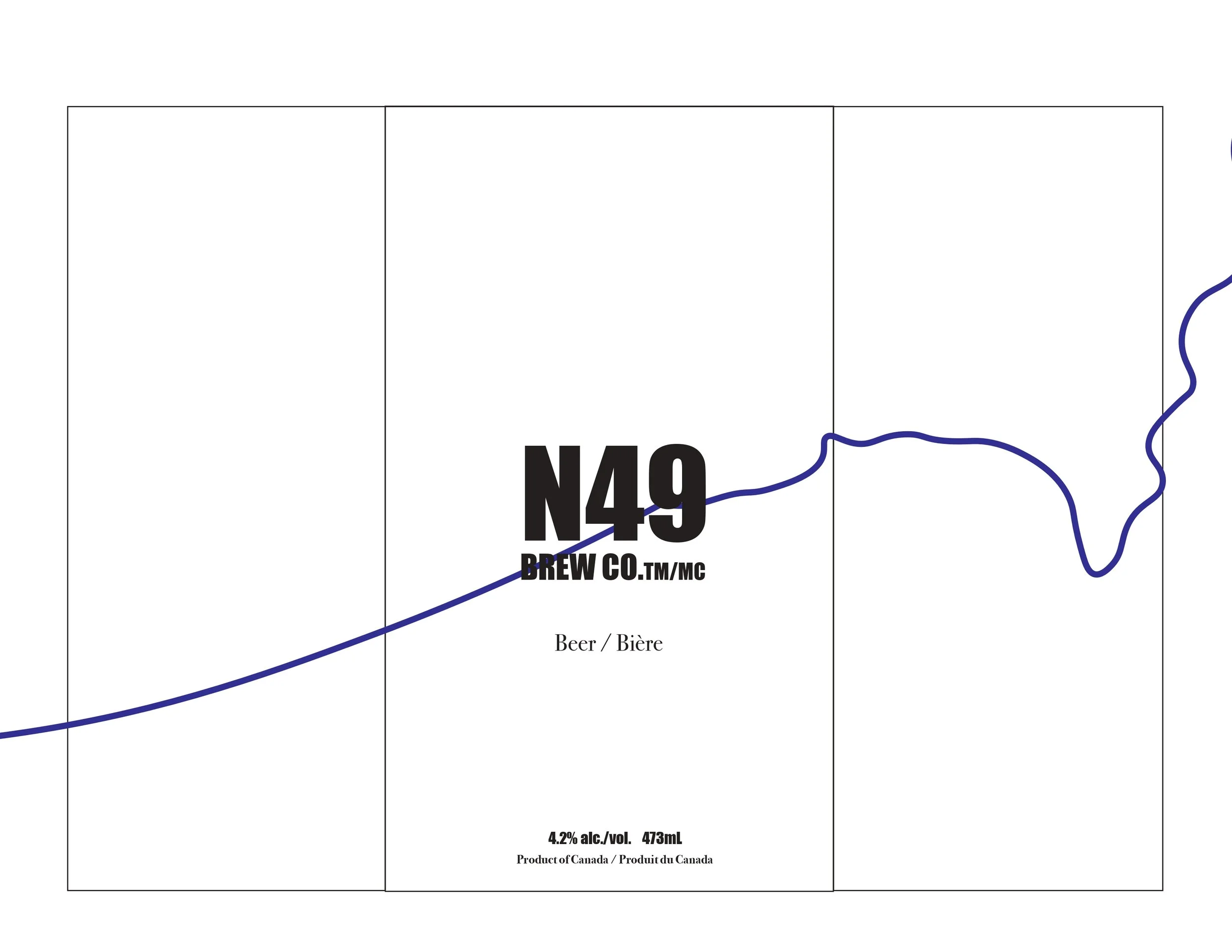
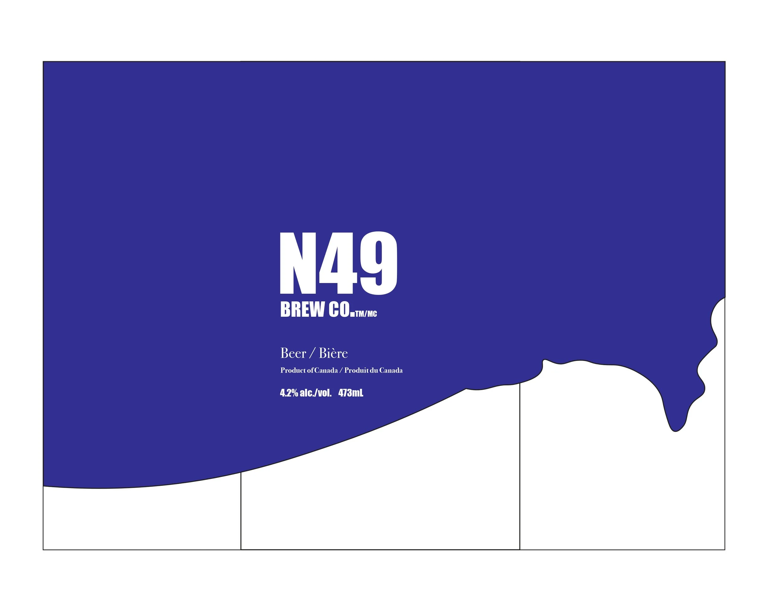
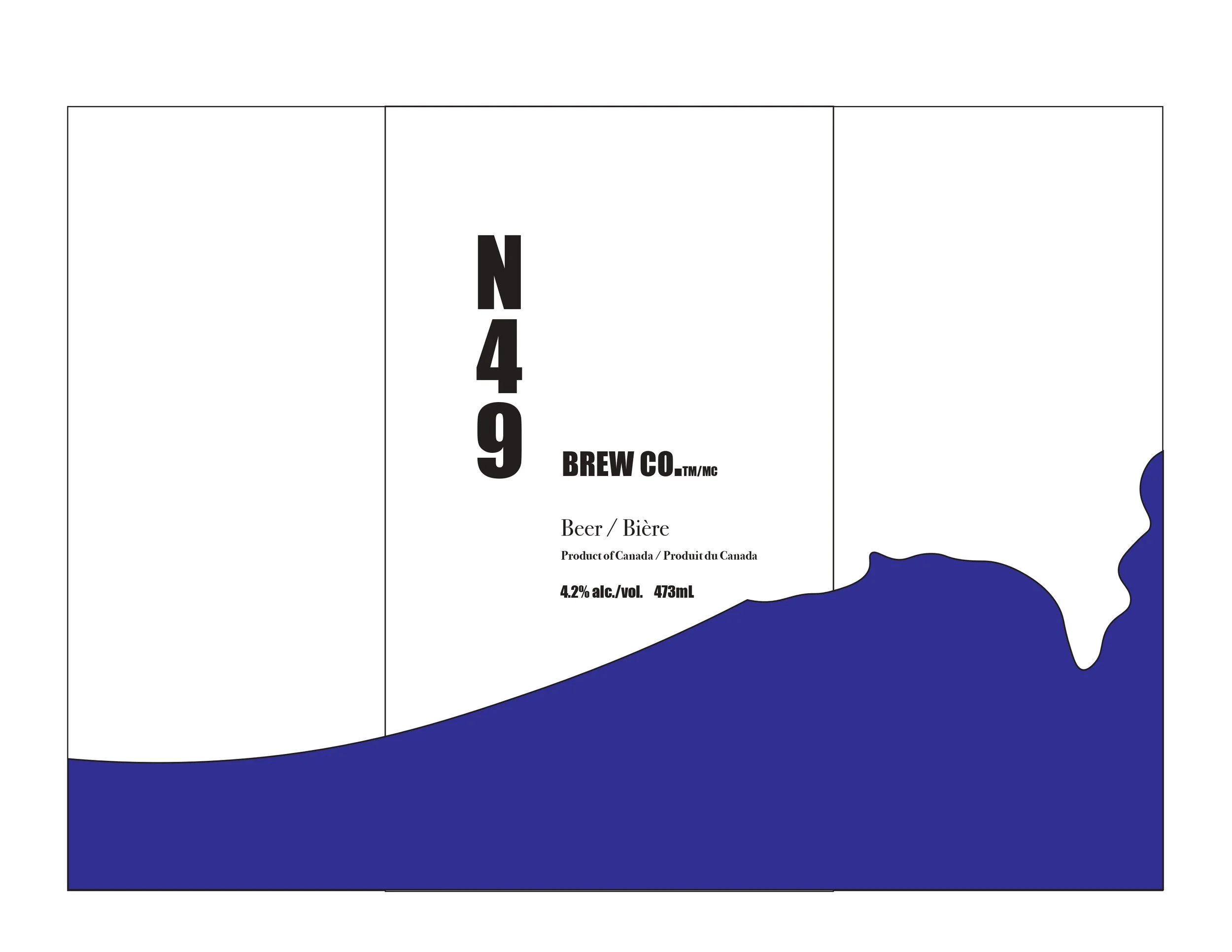
N49 - 49th parallel north
Packaging Design | Alcoholic Beverage Industry
This project presents a complete reimagining of packaging design, developed independently from any existing visual system. Guided by clearly defined marketing strategies, the work establishes a distinct and contemporary visual direction that is both purposeful and engaging.
Through the considered use of typography, form, and composition, the design translates strategic intent into a cohesive brand expression. The result is a fresh packaging system that captures attention, communicates meaning, and strengthens overall brand presence.
Design Project Outline
Marketing Background
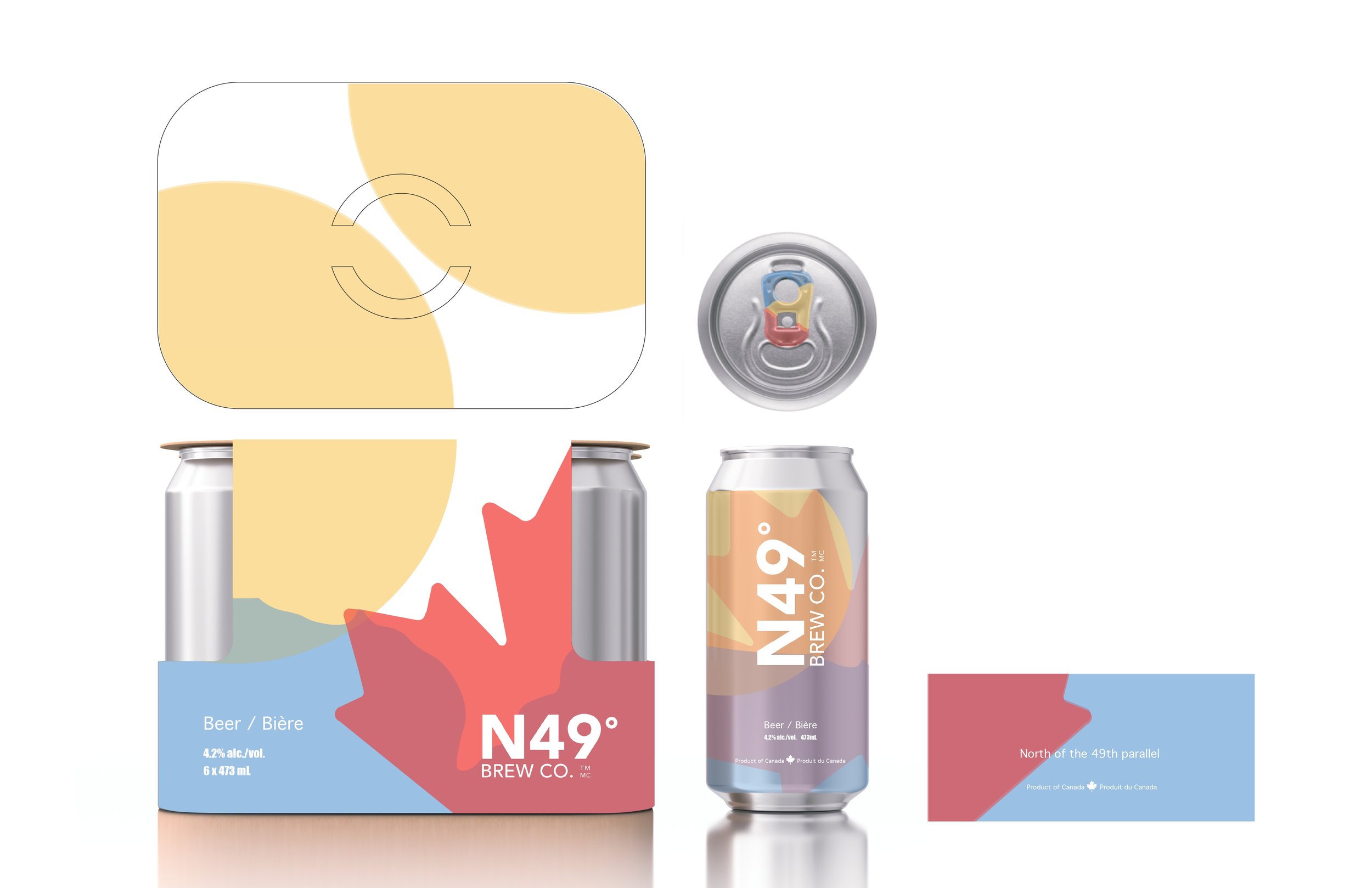
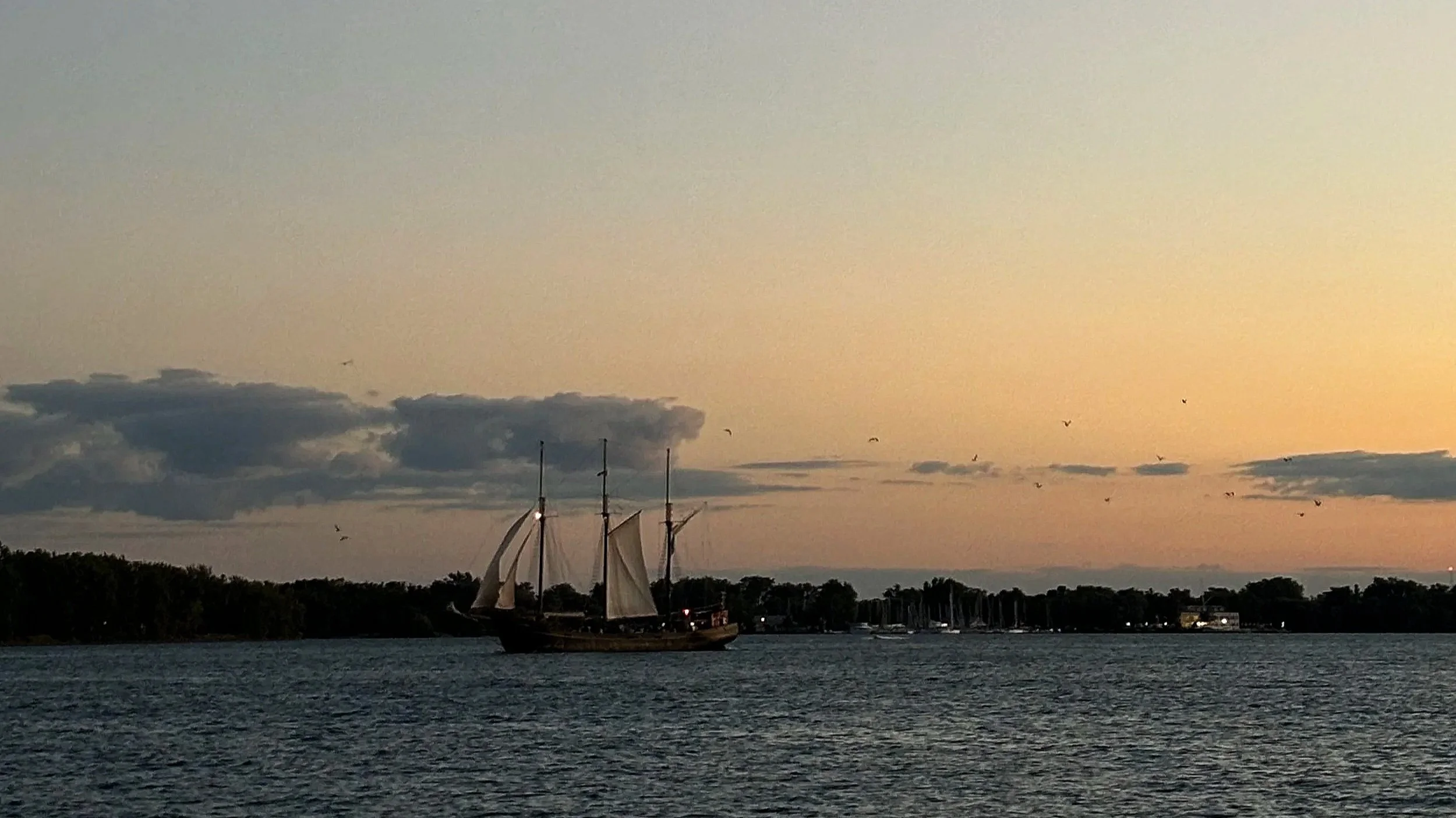
Molson is launching a summer limited-edition beer in Canada, designed for a younger audience enjoying weekends at cottages, camping, and concerts. The product celebrates reconnecting with friends and embracing the outdoors.
Client: Molson
Target Market: Canadian consumers aged 19–40 (primarily male), seeking a fresh, stylish, and unique beer option. Available at LCBO, Beer Store, and other retail locations across Canada.
Design Overview
Brand Concept & Personality
Summer craft beer with smooth, smoky flavour
Social, shareable, and “cool factor” appeal
Fun, playful, and extroverted
Edgy yet cool and sophisticated
Inspired by the weekend outdoor lifestyle
Branding & Design Requirements
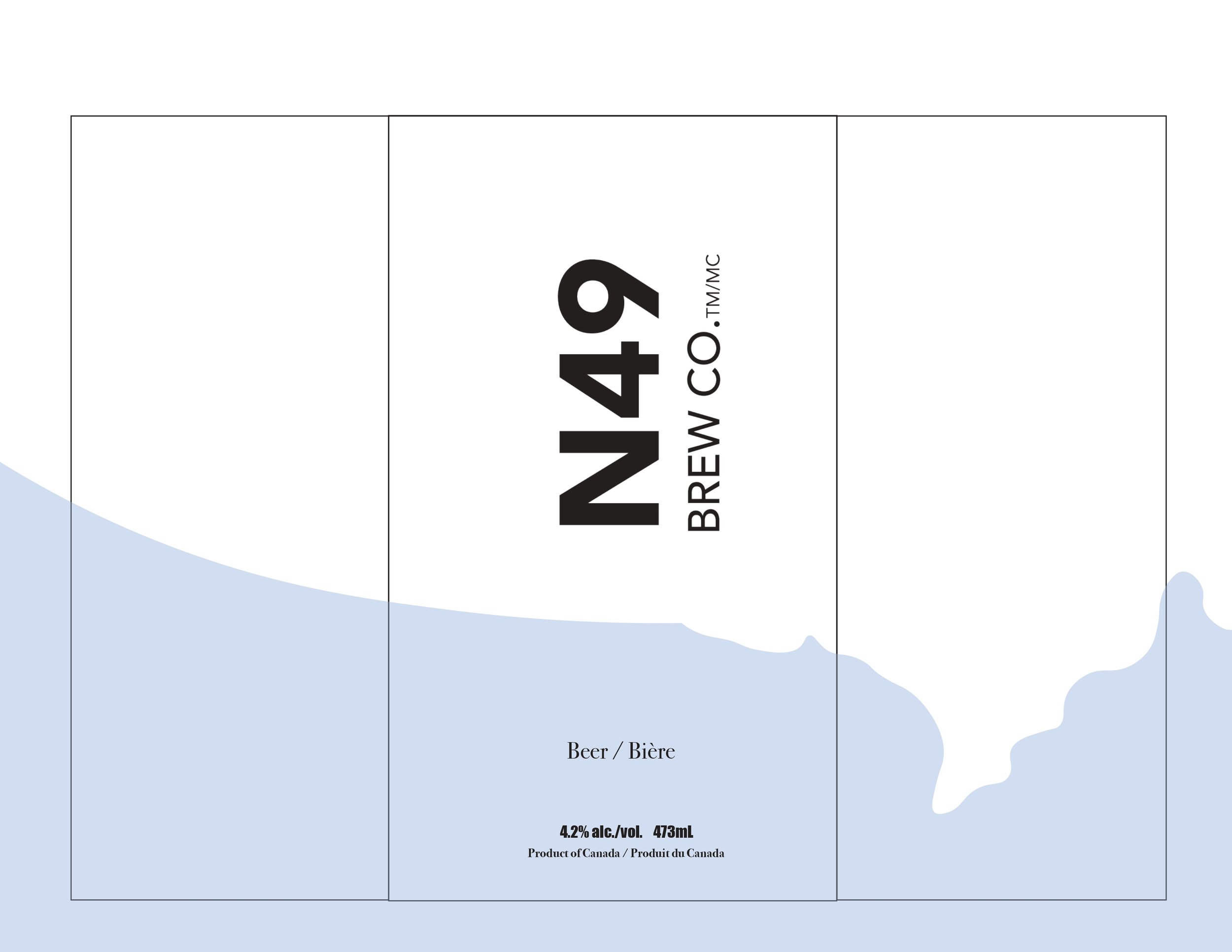
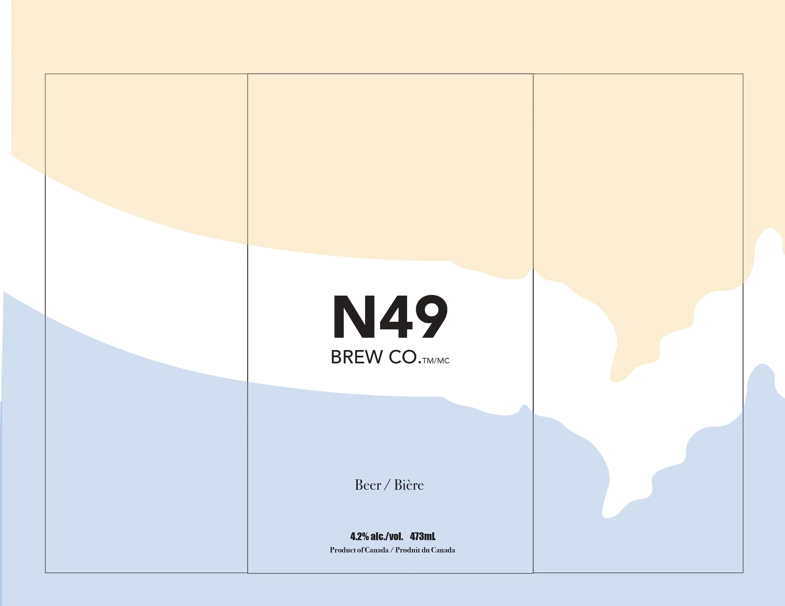
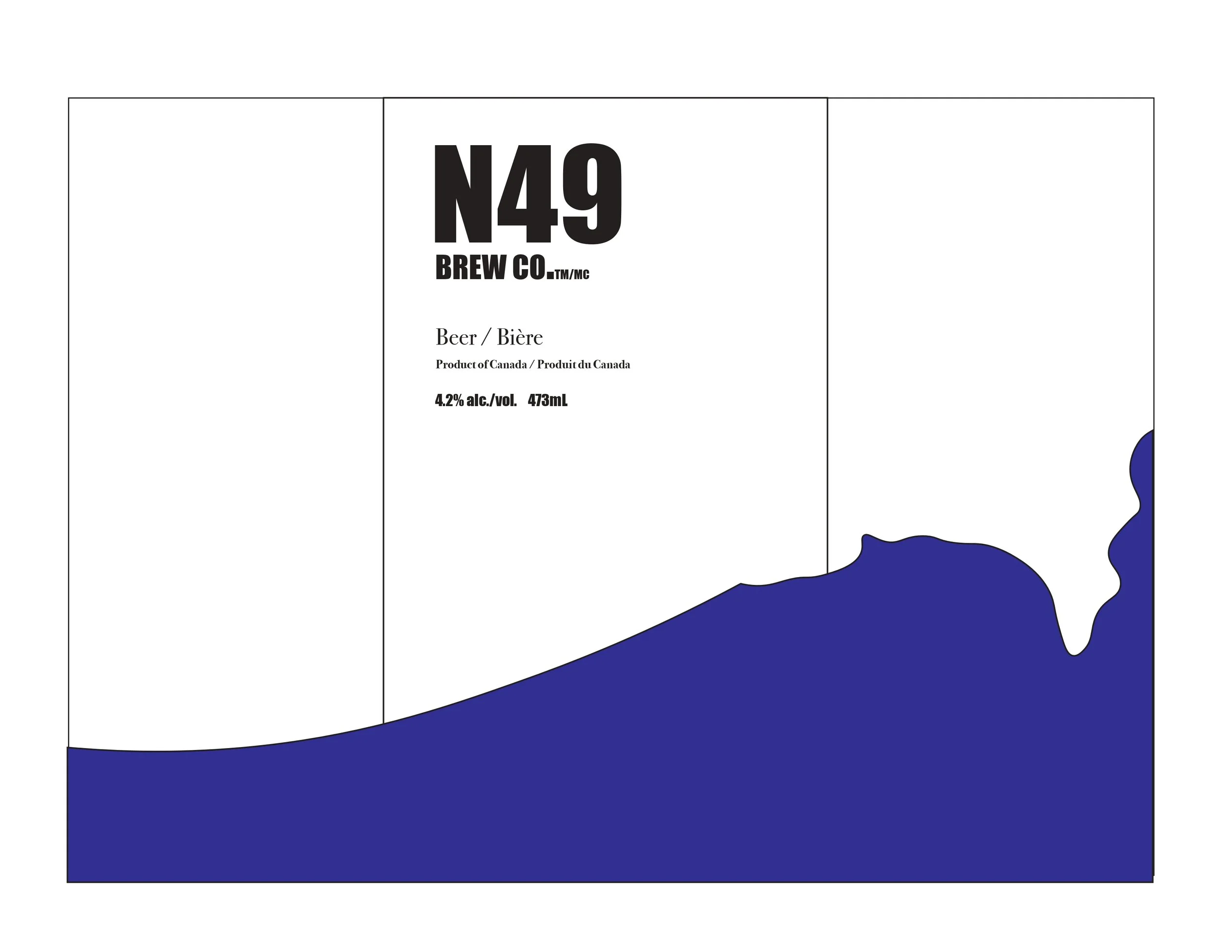
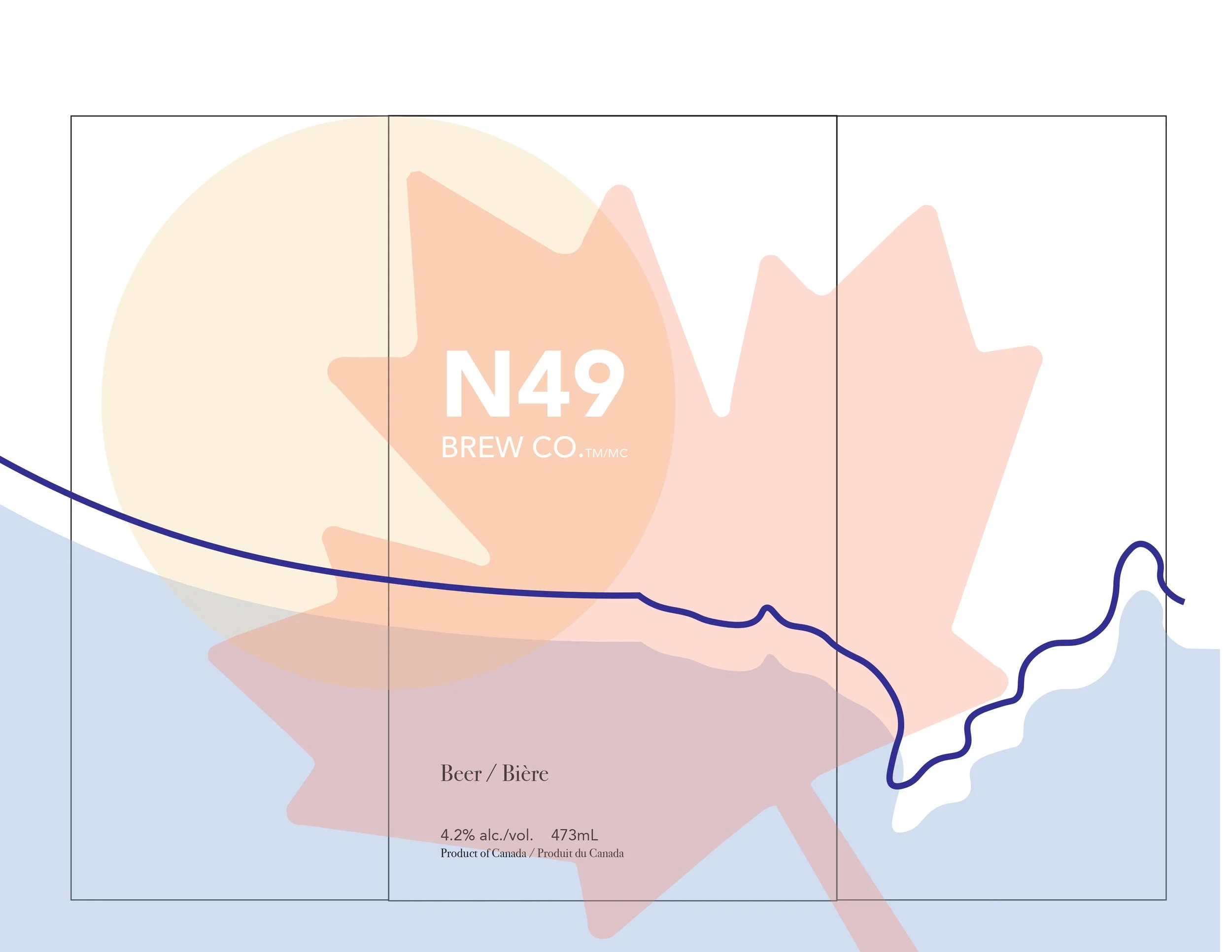
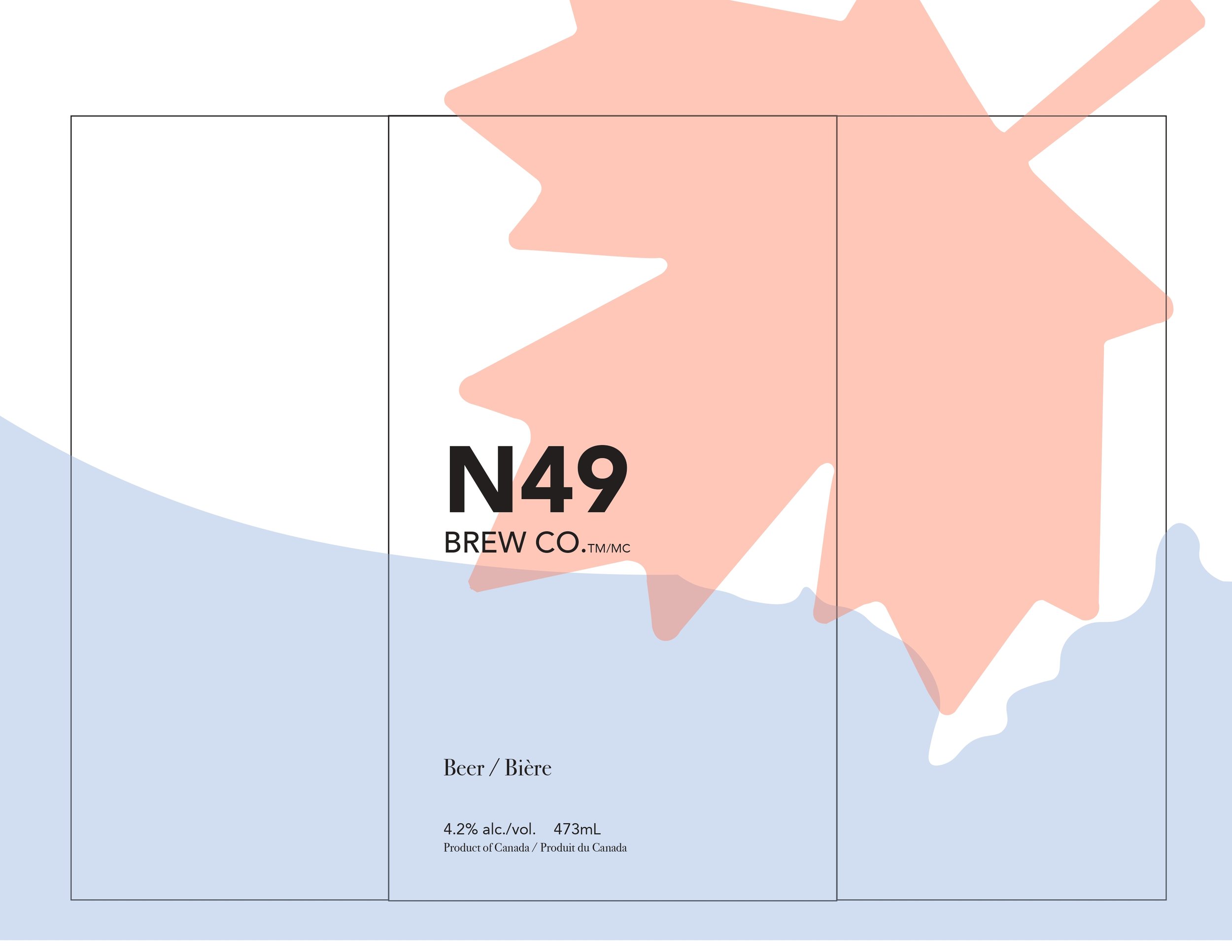
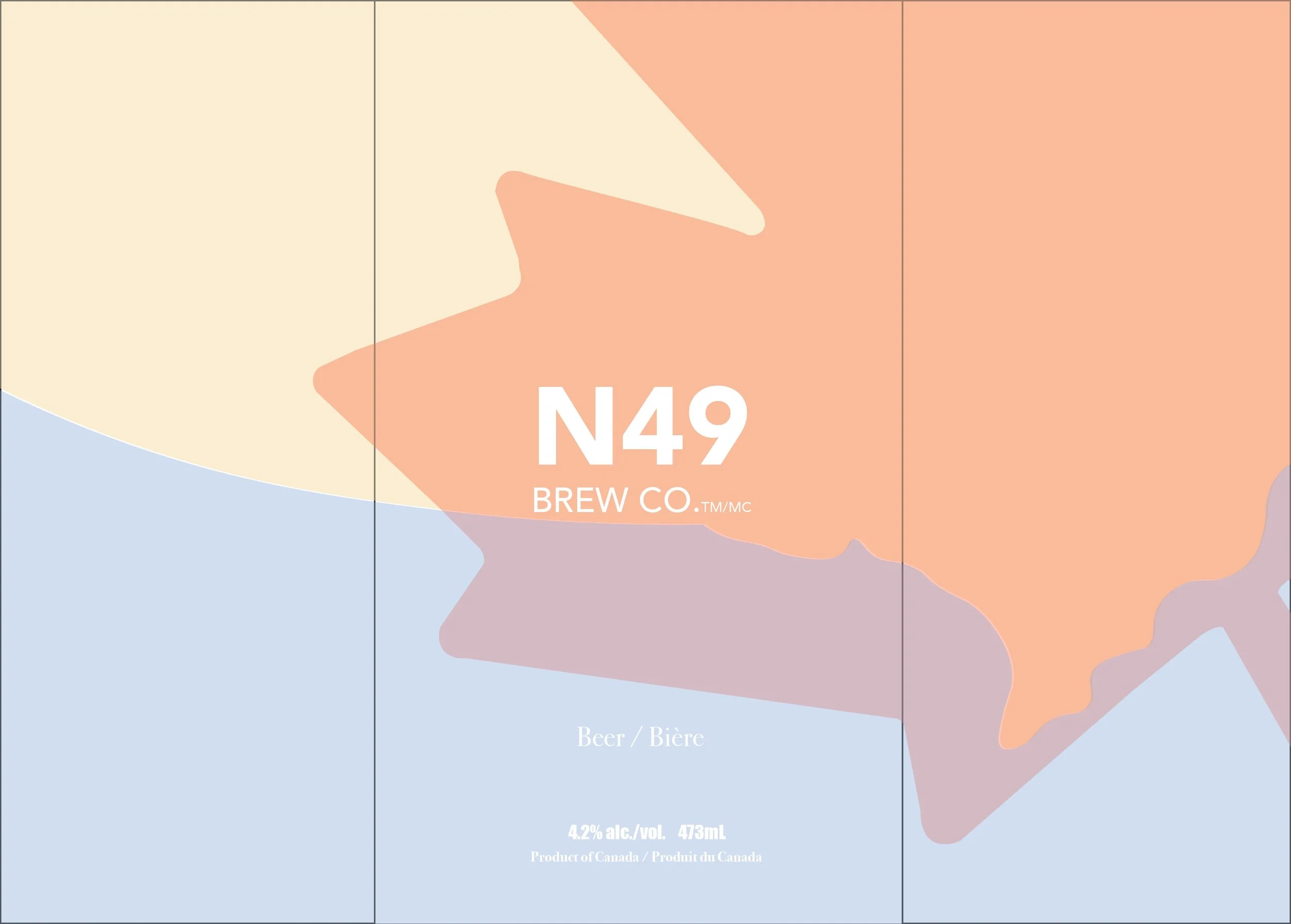
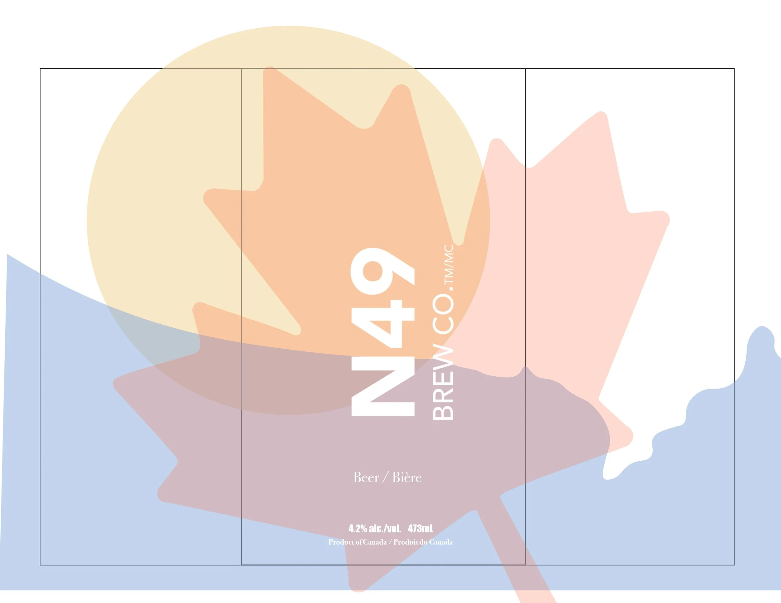
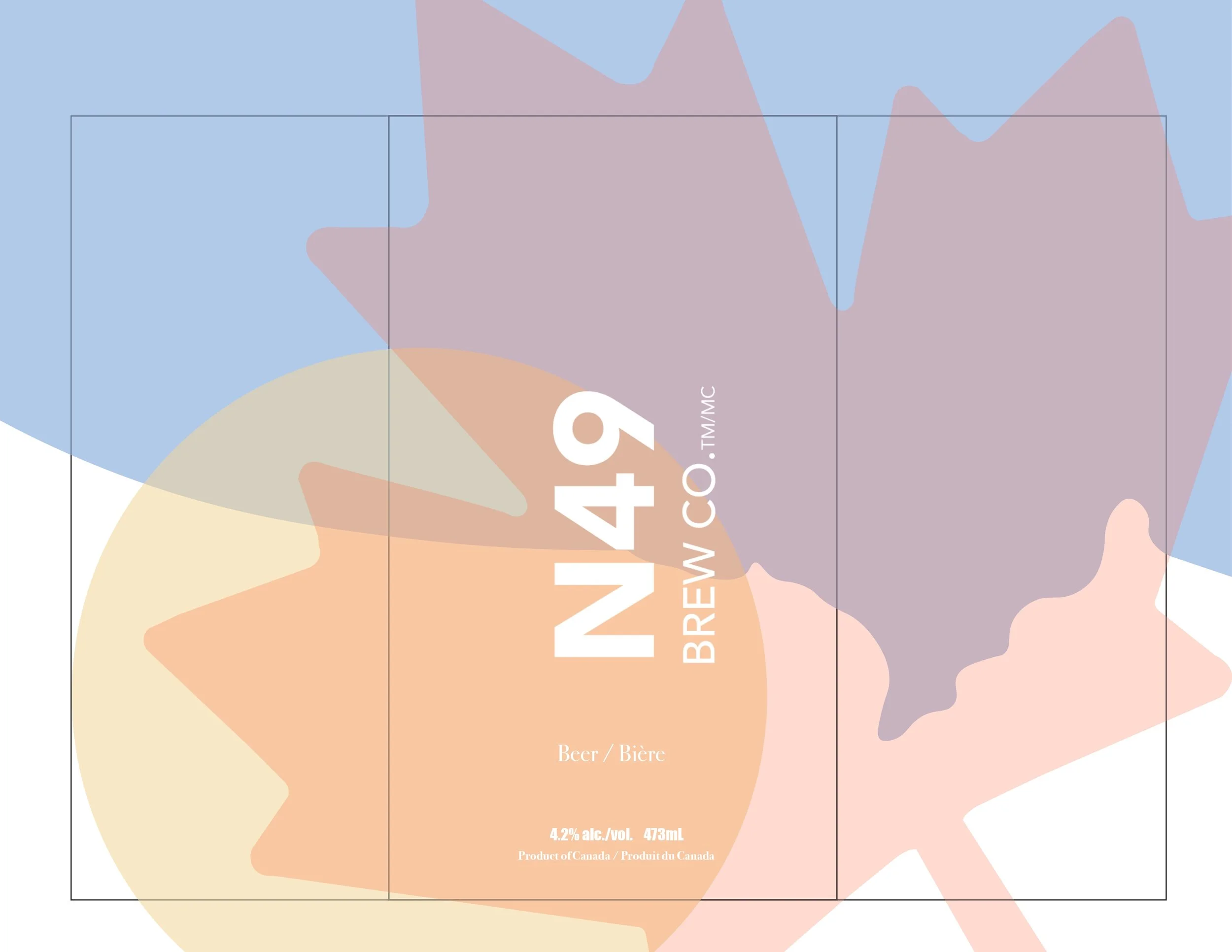
No Molson logo
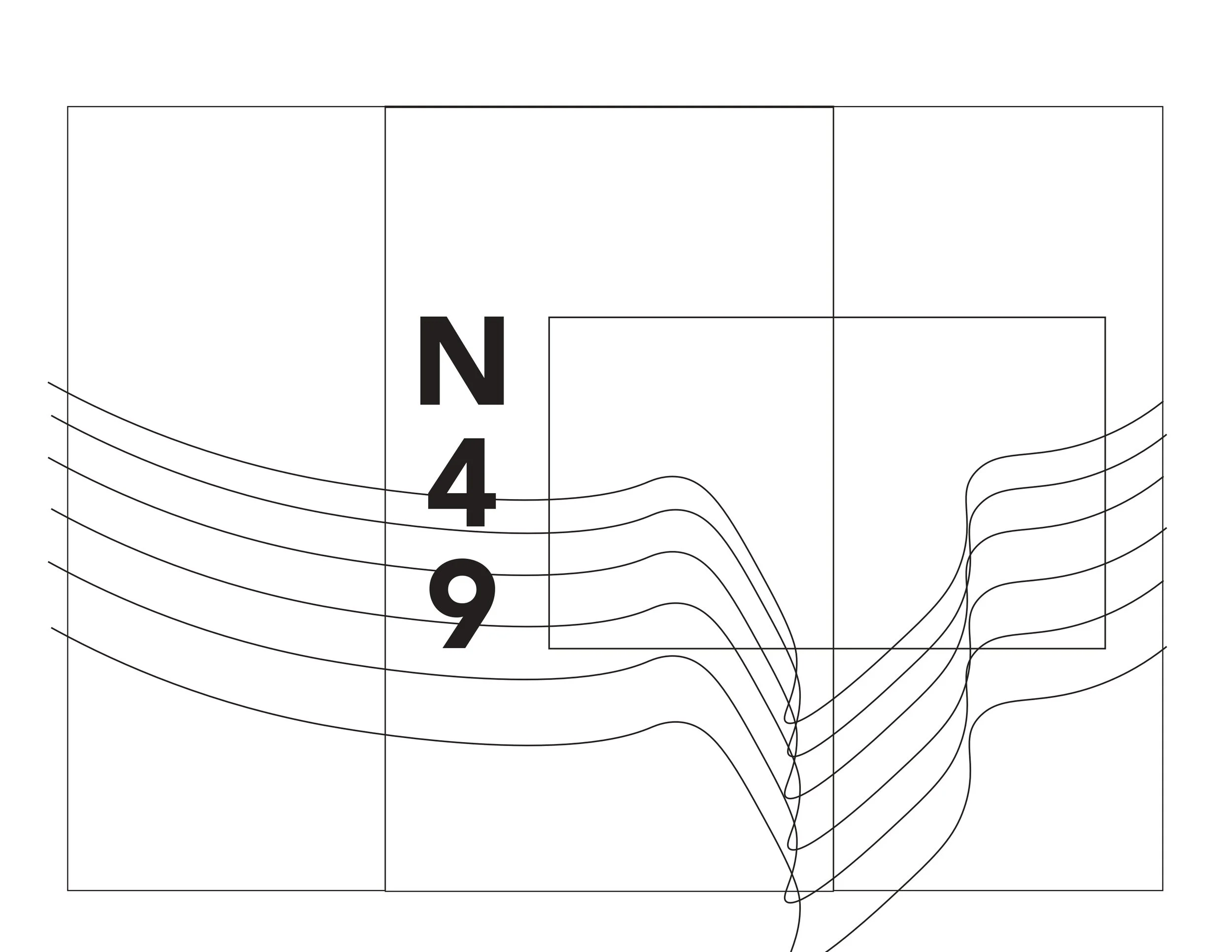
New identity: N49 Brew Co.™
Strong brand name
Include: Beer / Bière
Target Positioning
Competes with craft / seasonal beers
Similar pricing
Strong shelf impact required
Legal & Format
473 mL, 4.2% alc./vol.
Product of Canada / Produit du Canada
Bottle or can + 6-pack box
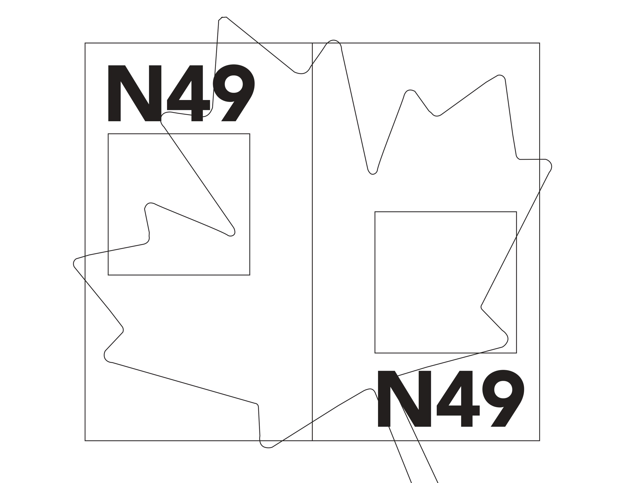
Design Process
Iterations and Explorations
Packaging Design Outcomes